The Forgotten Color Theory by Mary Gartside
Summary
Mary Gartside (c. 1755–1819) developed between 1805 and 1808 the first fully systematic, three-dimensional color system in the Western world. Her theory combined physical optics (Newton, Herschel), perceptual psychology, and aesthetic harmony theory into a coherent theoretical framework that was centuries ahead of its time. Her insights into context-dependent color perception, emotional effects of color, and quantitative laws of harmony surpass even modern systems like CIELAB in completeness and precision, forming the theoretical foundation for the next generation of adaptive, emotion-aware color technologies.
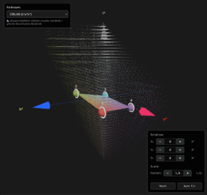
3D animation of Mary Gartside’s color sphere.
- Yellow: 48° (13.3%)
- Orange: 27° (7.5%)
- Red: 45° (12.5%)
- Violet: 80° (22.2%) – largest segment
- Indigo: 40° (11.1%)
- Blue: 60° (16.7%)
- Green: 60° (16.7%)
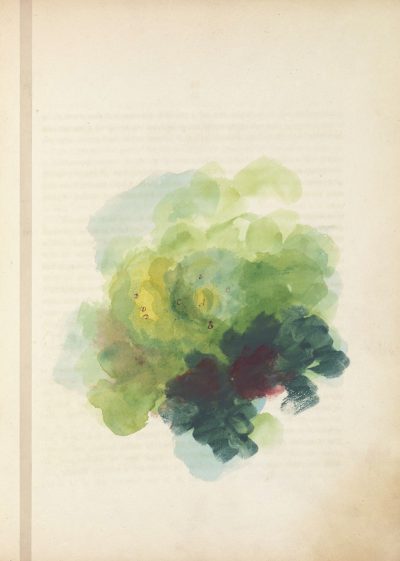
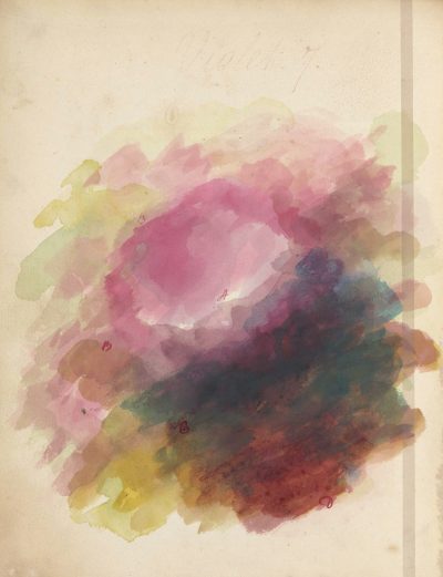
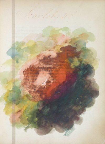


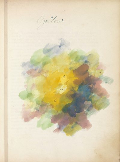
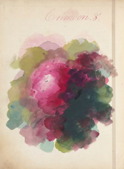
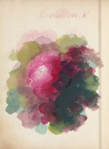
Watercolors from Mary Gartside’s “New Theory of Colours”
The so-called “blots” (color spots) served as expressive-emotional representations of specific color effects. An attempt to make aesthetic intuition tangible and to theorize it. Some even see them as an early form of abstract painting.
Why Goethe and Not Gartside?
It is difficult to write about Mary Gartside without asking why her name is so often missing. Her work New Theory of Colours was published in 1808—two years before Goethe’s famous theory of colors—and anticipated many of his ideas remarkably well. Yet Gartside’s name is nowhere to be found in the footnotes of Goethe research or in the established secondary literature on color theory. It is striking how consistently she has been overlooked in academic reception, even though her ideas provide a remarkably independent foundation for a subjective theory of color.
Although there is so far no clear evidence that Goethe knew her work—a charge of plagiarism would be inappropriate—the question of why Goethe is regarded as the central figure of a subjective color theory while Gartside was almost forgotten is justified. The rediscovery of her texts is thanks to the German-British art historian Alexandra Loske, who came across Gartside during her PhD research at the Royal Pavilion in Brighton. Since then, she has been continuously working to bring Gartside’s contribution to color theory into the light of art historical research, thereby opening up a largely overlooked chapter in the history of color.
Color as Sensation – Gartside versus Newton
At a time when Newton’s spectral decomposition of light was regarded as an almost untouchable paradigm, Gartside pursued a contrary approach. While Newton explained colors physically—as broken components of white light—Gartside emphasized subjective perception. For her, color was not a measurable quantity but a feeling. A “moral effect”—as she called it—emanated from colors; each color carried emotional and psychological qualities far beyond the physical level.
Thus, she wrote not only against Newton’s objectivism but established—much like Goethe later—a distinct phenomenologically oriented theory of color. Yet while Goethe’s work enjoyed centuries of reception, Gartside’s voice remained unheard for a long time. Her countercurrent to Newtonian theory remained a side note—unjustly so. Gartside recognized early on that color cannot simply be explained by wavelengths but arises from a complex interplay of light, surface, environment, and sensation.
The Blots – Color as an Autonomous Phenomenon
A particular feature of Gartside’s work are the so-called “blots”—cloud-like color stains that she incorporated as an integral part of her books. These color fields stand for a radical idea: color does not have to illustrate; it can speak for itself. The “blots” express an experimental way of thinking that understands color not merely as a means to an end but as an independent artistic medium.
At a time when abstraction as a concept did not yet exist, Gartside created visual color field compositions that depicted neither form nor object. Rather, they were meant to make the intrinsic effect of color—its emotional resonance, its luminous power, its harmony—immediately tangible. Some art historians see in this a foreshadowing of abstract painting, which only became popular a century later with artists like Hilma af Klint or Wassily Kandinsky. Gartside combined poetic sensitivity with systematic observation—a remarkable balancing act between feeling and structure.
Color Harmony as a System – Gartside as Theorist
Mary Gartside was not only a talented colorist but also the first woman to formulate a complete, systematic model of color harmony. This model is based not on purely aesthetic feeling but on mathematical proportion, observation of nature, optical experiments, and psychological effects. She developed a holistic color system that draws on universal principles while remaining open to subjective sensations.
1. The Law of Proportions
At the core of her system is a clearly defined ratio between warm and cool colors. Warm colors—red, orange, yellow—take up one-third of the color wheel, cool colors—blue, green, violet—two-thirds. According to Gartside, this creates a harmonious balance. This principle can be applied across various design contexts—from painting and interior design to fashion.
“Unchanging harmony arises when the warm part of the spectrum stands in a 1:2 ratio to the cool part.”
— Mary Gartside, circa 1805
2. Three Forms of Color Relationships
Gartside distinguished three archetypal relationships between colors:
A) Harmonizing Tints:
Adjacent colors that gently blend into each other—ideal for calm, atmospheric compositions that evoke a meditative effect.
B) Contrasting Tints:
Complementary colors that create tension and focus attention—particularly suited for dramatic or expressive depictions.
C) Reflected Tints:
Color mixtures that mediate between foreground and background, often with earthy or neutralized tones—these provide depth and balance.
3. The Three-Mass Theory – Color as a Stage
In her theory of the “three masses,” Gartside compares color spaces to a theatrical stage. Bright primary colors act as the main actors, mixed secondary colors form the mediating layer, and neutral tertiary colors create the calm background. This hierarchy produces an almost musical spatial effect, where color functions as a dramaturgical element. Color composition thus becomes staging—a concept that later became central in the color dramaturgy of stage sets and films.
Psychology of Color – Colors as Emotional Fields
Gartside described color not as an abstract quantity but as a field of sensation. She analyzed how individual colors affect the human mind, combining intuitive impressions with systematic observation:
- Yellow: Radiant, cheerful, light-filled—symbolizes openness and joy of life
- Red: Activating, strong, penetrating—represents energy, passion, danger
- Blue: Cool, calming, distant—has an ordering, contemplative, inner effect
- Violet: Delicate, spiritual, mystical—associated with transcendence, sensitivity, depth
- Green: Mediating, neutral, natural—stands for balance, growth, and renewal
These attributions were not mere associations but based on careful observation of optical and atmospheric effects—such as light reflection, distance, and shadow. Gartside assumed that each color carries a psychological signature that can be purposefully used in design.
Gartside and the Fundamentals of the CIELAB Model
Many of her ideas are reflected today in modern color systems such as the Munsell system or the CIELAB model. As early as around 1805, Gartside spoke of an “illumination power” — the ability of colors to reflect light — and systematically distinguished between brightness, saturation, and color temperature. She recognized that colors are not static but change depending on light and environment.
While Newton understood color as a result of light refraction, Gartside developed a multidimensional model that considered aspects such as emotional effect, lighting conditions, and contextualization. This holistic perspective is exactly what is reflected in CIELAB, which was developed in the 1970s by the CIE (Commission Internationale de l’Éclairage) as a unified model for color perception.
CIELAB is based on three axes: Lightness (L), Red-Green (a), and Blue-Yellow (b). Gartside had already anticipated these dimensions, albeit not in mathematically coded form. Her work thus forms an ideal foundation for a color space oriented to human perception. In a way, she was more than a century ahead of her time.
The Future Potential of Gartside’s Theory
Mary Gartside’s approaches could still provide inspiration today — for example, for the further development of color psychology models or the extension of CIELAB with emotional parameters. Her emphasis on subjective perception, contextual sensitivity, and atmospheric effect opens new perspectives for design, architecture, interface design, and art mediation. Gartside did not think of color as an isolated phenomenon but as a relational field.
Especially in times of AI-generated color design and algorithmic color palettes, a return to the sensual, psychological dimension of color is more relevant than ever. Gartside’s blots could be used in digital interfaces to immediately visualize color moods. Her three-mass model could also find new applications in scenography, color dramaturgy, or mood design. Her work is an invitation to understand color again as a living carrier of expression — beyond mere codes and systems.
Conclusion – Why Mary Gartside Must Be Rediscovered
Mary Gartside was a pioneer whose time is only just beginning. Her work is not only an early feminist milestone in color theory but also offers a comprehensive, sensitive, and surprisingly modern system. The fact that her name is missing from textbooks is an oversight that needs correcting. She embodied a way of thinking that combines scientific accuracy with artistic sensibility — a synthesis that can still inspire today.
Goethe was a great thinker — but he was not alone. Alongside him stood, largely unseen, an artist and theorist whose colors still shine today. It is time to finally give Mary Gartside the place in history she deserves. Her ideas are too valuable to remain in the shadows of history any longer.
References
-
Loske, Alexandra: Mary Gartside: A Forgotten Colour Theorist. In: Journal of Art History, 2017.
-
Loske, Alexandra: Colour: A Visual History from Newton to Pantone. London: Welbeck Publishing, 2019.
-
Gartside, Mary: An Essay on Light and Shade. (Original manuscript, circa 1805). Facsimile edition, 2021.
-
Vollmer, Kirsten: Early Women in Colour Theory: Mary Gartside and Her Legacy. Routledge, 2023.
-
Eiseman, Leatrice: The Pantone Book of Color: Understanding Color Theory and Practice. Harper Design, 2011.
-
Gladwell, Malcolm: The Colour of Ideas: Women Pioneers in Science and Art. Penguin Books, 2018.
-
Kuehni, Rolf G.: Color Space and Its Divisions: From Theory to Practice. Wiley, 2012.
-
Westland, Stephen; Ripamonti, Caterina; Cheung, Vien: Computational Colour Science Using MATLAB. Wiley, 2012.
-
CIE – Commission Internationale de l’Éclairage: Colorimetry (CIE Publication No. 15), 3rd Edition, 2004.