Why we have always calculated color harmonies incorrectly - calculating modern color harmonies in CIELAB
I have been intensively engaged with color harmonies and their calculation lately and can say quite confidently that all previous approaches to calculating harmonies were wrong. Well, not fundamentally wrong, but there are significantly more elegant ways to calculate color harmonies. My new color generator is based on a fundamentally new approach that can derive not just a handful of harmonies from a base color, but virtually infinite ones. Moreover, these harmonies are not only technically correct but adapted to human perception.
To explain what I have done, I need to elaborate a bit and retell the history of color harmonies. Even though all of this is already known, it’s important for me to repeat it in order to better build my argument.
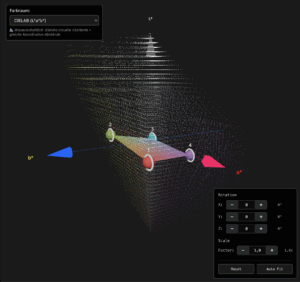
Representation of the visible RGB color space in a CIELAB coordinate system.
The (European) History of Color Harmonies – Two Currents
Isaac Newton was probably the first who discovered in 1705 that white light contains all colors and these can become visible through refraction through a prism. From this he derived seven basic colors (red, orange, yellow, green, blue, indigo, violet) and already arranged these in a first model of a color circle. Particularly significant was the insight that color is not a property of matter, but of light. His interest was purely physical and not aesthetic. He was concerned with the decomposition and systematic analysis of light.
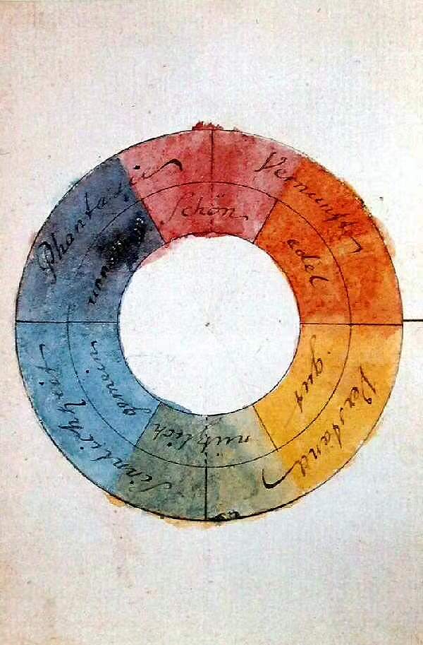
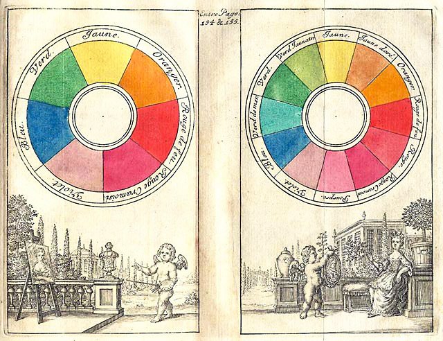
A different approach, which consciously opposed Newton, came even before Goethe from the Englishwoman Mary Gartside. In history, Goethe’s color theory from 1810 is always mentioned directly, but with closer research it became apparent that Mary Gartside formulated similar thoughts 5 years before him, in 1805, and published studies on it. While there is no evidence that Goethe plagiarized from her, it is likely that he knew her works, and the overlaps are somewhat too strong to have been purely coincidental.
Mary Gartside founded a color theory that was not supposed to be based on pure mathematical calculations, but on human aesthetics. Color effect took center stage in her system. She worked as an artist with watercolor paints and was concerned with the perception and harmony of colors. For example, she found that cold and warm colors in a picture have a harmonious effect when they are present in a ratio of 1:2 (warm:cold). Her model of a color sphere is oriented toward this distribution.
The mathematical approach of Newton was followed by scientists like Thomas Young, who laid the foundation for the RGB color space, and Hermann von Helmholtz, who researched the physiological basis of color perception and the visual apparatus. From this developed more or less the RGB system, which is used as standard in media design today, and the CMYK printing colors.
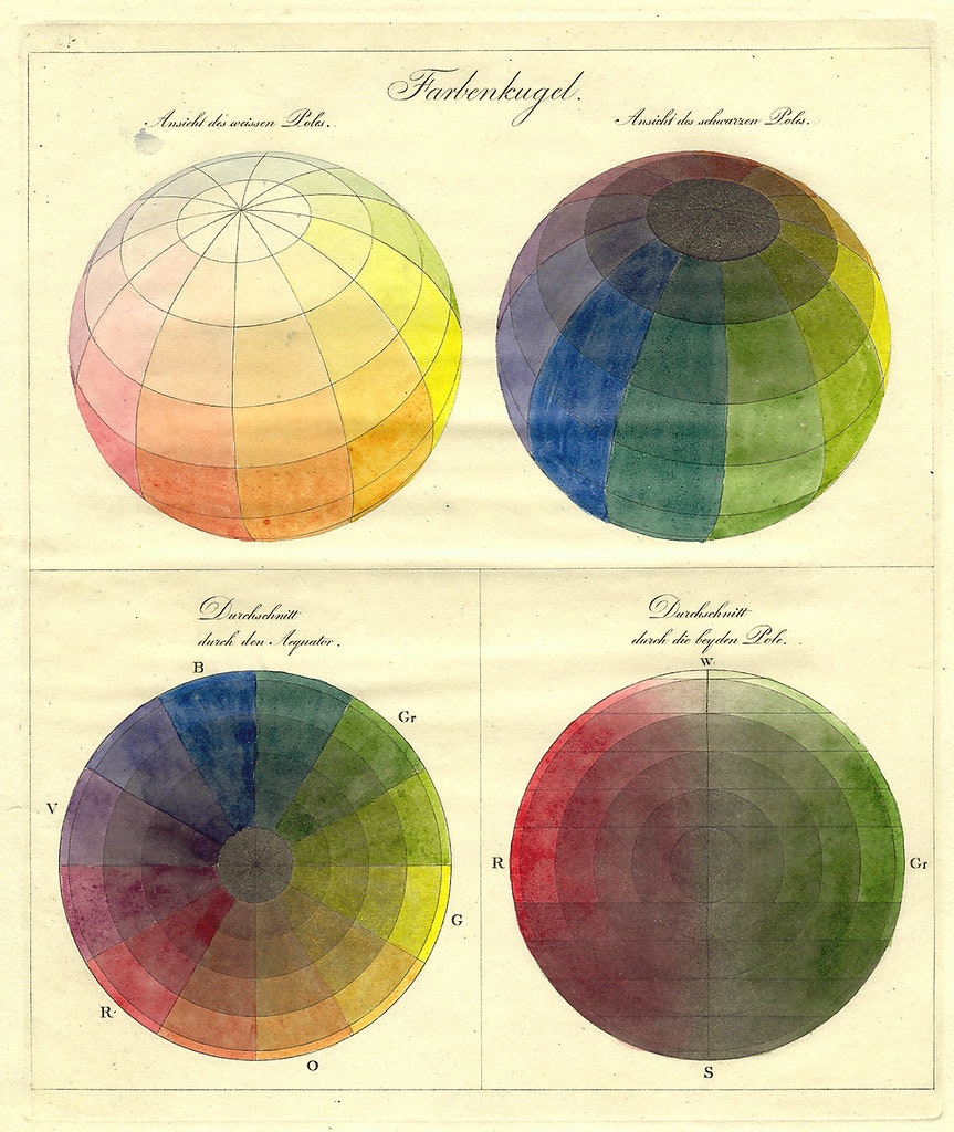
On the other side, artists and designers after Gartside researched color harmonies based on color perception. There followed Johann Wolfgang von Goethe, who tried to connect color theory with cultural peculiarities (often racist from today’s perspective), and later Philipp Otto Runge, who similarly to Gartside developed a model of the color sphere. Later followed Johannes Itten, who more strongly investigated the relationship of colors and highlighted contrasts, and Emily Noyes, who further developed Gartside’s theories and developed an early form of color quantification. From this developed the CIELAB color space. And that is exactly the point where I applied my tool. More on that later.
RGB is Utterly Unsuitable When It Comes to Calculating Color Harmonies
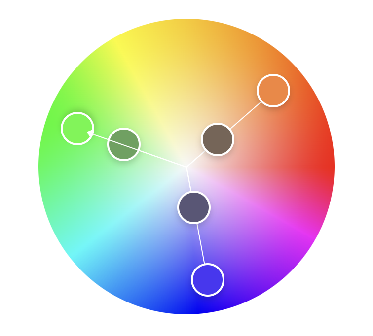
Most current tools that can be used to calculate color harmonies still work on the basis of RGB or HSV. From a purely mathematical perspective, it might make sense to calculate in this space, but nevertheless the harmonies generated this way often appear unnatural or even disturbing. I personally could never get much out of these tools and preferred to rely on my intuition to create more vibrant color palettes for myself and my clients (or I simply stole from elsewhere like all designers do, but we don’t talk about that).
Furthermore, a very static approach has always been used until now. A base color led to a severely limited number of palettes that allowed no variation, adjustment, or anything else.
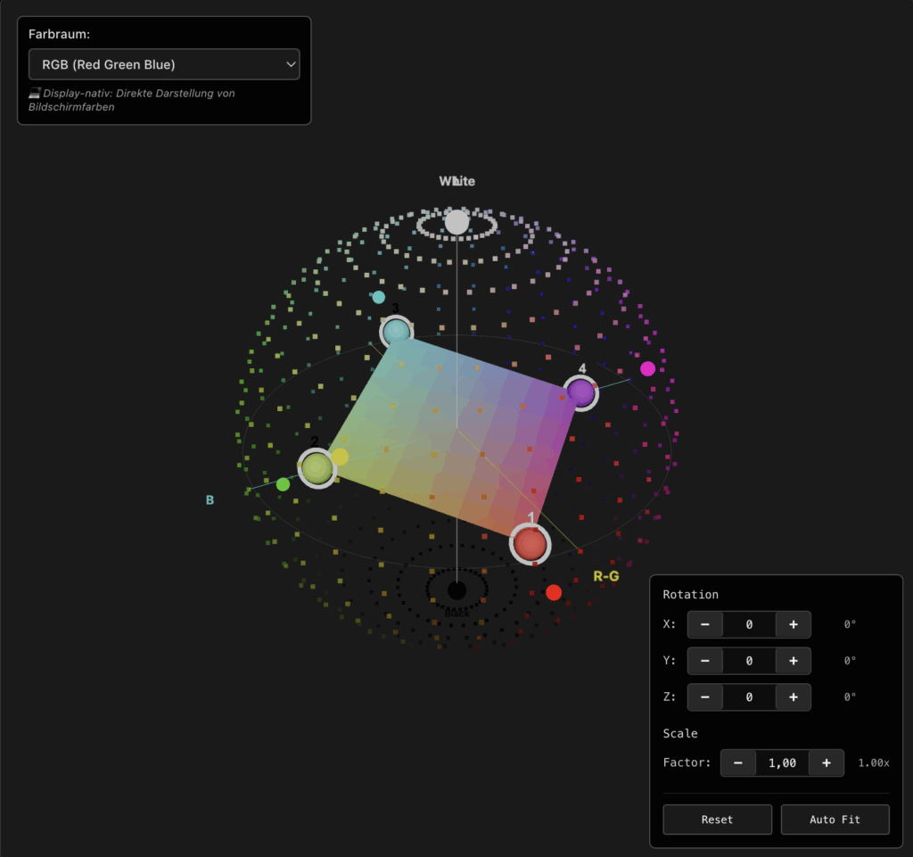
My Approach: 3D Color Harmonies in RGB Color Space
My actual idea was to no longer calculate color harmonies in a 2D space as usual, but to also include all light and dark colors and move into 3D space. The theory was quite simple: If we find harmonies in 2D space by drawing triangles or squares in a color circle, this should actually also work in 3D space, and these shapes should actually be able to rotate in all directions, and harmonies should actually emerge from this as well. Actually…
My first attempts in RGB were rather laborious. I did succeed in creating shapes in 3D space and rotating them, but the palettes were not as harmonious as I had hoped.
I was already on the verge of discarding the project, but instead I dealt more closely with old and new color theories again, and as mentioned above, I found the CIELAB color space.
The Solution: The CIELAB Color Space
The CIELAB color space was defined in 1931 by the CIE (Commission Internationale de l’Éclairage) and was significantly further developed in 1976 and 2000. The goal was to connect both above-mentioned currents and provide a mathematical approach that allows both objective analysis of color values and includes subjective human perception.
An example of this is the Weber-Fechner law, which states that stimulus discrimination decreases with increasing intensity of stimuli. If you hold a weight of 100g in your hand and weight is continuously added, you will begin to notice a difference at about 102g. But if you hold a weight of 1000g in your hand, you only notice a difference at about 1020g. The same applies to more intense color tones. We react much more sensitively to the distinction of medium color tones than to very light or dark color tones. Mathematically speaking, the perception of a stimulus does not increase linearly, but logarithmically to the stimulus intensity.
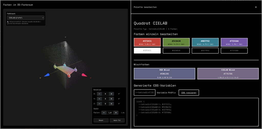
These and other perceptual distortions are calculated into the CIELAB color space, and as the basis for the units within the space there is the constant ∆E. 1 ∆E corresponds approximately to the smallest possible distinction between two colors, whereby ∆E then describes larger distances when the colors become more intense. This results in a distorted color space that has more the shape of a blob and cannot be represented in a sphere or cube.

My New Approach: 3D Color Harmonies in CIELAB Color Space
At first this sounded quite easy, but the implementation was then much more complicated than expected. Unlike the regular RGB color space, CIELAB is neither spherical nor square, but has the shape of a blob (an irregularly distorted form).
This doesn’t exactly make it easy to perform calculations in this space, but with a lot of patience and the help of AI, I was able to solve the problems. The current version of my color generator is capable of calculating color harmonies in CIELAB and representing them in 3D space. And the best part: my theory with rotation really works. Each rotation produces a new color palette that again looks harmonious, at least to my eye.
You’re welcome to test my tool yourself and send me feedback.
How It Continues
The first step is definitely accomplished, and initial results can be achieved. However, diving into color theory has unleashed countless other theories in my head, and I think we’re just at the very beginning of a modern color theory. It’s conceivable that on this basis we could develop a kind of notation system for colors, we could let cultural peculiarities flow into the calculations, or have palettes colored with certain moods…
It will definitely continue, and I’m excited about reactions, feedback, and ideas. Feel free to sign up for my newsletter and follow me on the common channels.